Our Use Case
Let’s imagine we are building a component that displays a collection of cards.
Each card contains an image, a title, and a short description.
To highlight the key features, we add a bullet list. We also include a small footer text to balance the layout and avoid awkward empty space.
Let’s Code!
So, first the card.
We already identified the image, title, description, feature-list and footer text.
Because the text area has padding while the image should span the full width, it makes sense to split the card into two wrappers.
<div class='demosg__card'>
  <div class='demosg__card'>
    <div class="demosg__img-wrapper">
      <img src="https://images.unsplash.com/photo-1695067440629-b5e513976100?crop=entropy&cs=tinysrgb&fit=max&fm=jpg&ixid=M3w3Nzg4Nzd8MHwxfHNlYXJjaHwxfHxtb2Rlcm4lMjBhcmNoaXRlY3R1cmUlMjBidWlsZGluZ3xlbnwxfHx8fDE3NzAyMjc2ODZ8MA&ixlib=rb-4.1.0&q=80&w=1080"/>
    </div>
    <div class="demosg__content-wrapper">
      <h3>Modern architecture</h3>
      <div class="demosg__content">Explore the beauty of contemporary design and innovative building structures that shape our urban landscapes.</div>
      <ul>
        <li>Sustainable design practices</li>
        <li>Integration with natural environments</li>
        <li>Innovative use of materials</li>
      </ul>
      <div class="demosg__footer">Last updated: February 2026</div>
    </div>
  </div>
</div>
Next, we place the cards inside a container that uses a three column grid.
<div class="demosg__card-container">
  - card1
  - card2
  - card3
  - etc
</div>
The accompanying CSS looks like this:
.demosg__card-container {
display: grid;
grid-template-columns: 1fr;
gap: 1rem;
}
.demosg__card {
border-radius: .5rem;
overflow: clip;
background-color: #fff;
box-shadow: 0 1px 2px -1px #ccc;
}
.demosg__img-wrapper {
aspect-ratio: 16/9;
overflow: clip;
img {
width: 100%;
height: 100%;
object-fit: cover;
}
}
.demosg__content-wrapper {
display: grid;
gap: .5rem;
padding-inline: 1rem;
color: #4a5565;
font-size: 12px;
h3 {
font-size: 14px;
font-weight: 600;
margin: 0;
}
ul {
list-style-position:initial;
margin-inline: .65rem;
::marker {
color: #2b7fff;
}
}
}
.demosg__footer {
font-size: 10px;
border-top: 1px solid #ccc;
padding-block: 0.5rem;
}
@media(width > 512px) {
.demosg__card-container {
grid-template-columns: 1fr 1fr 1fr;
}
}
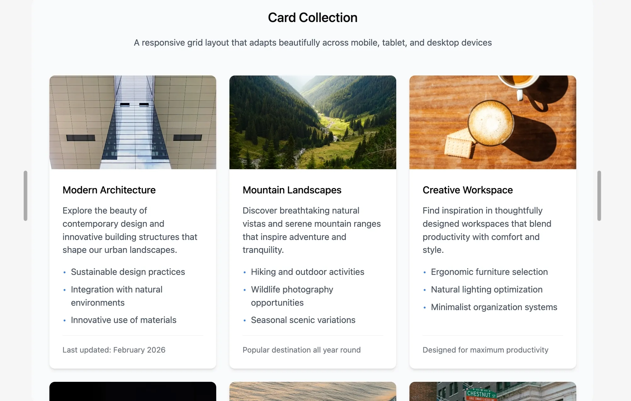
And that gives us a nice looking card grid.
Modern Architecture
Explore the beauty of contemporary design and innovative building structures that shape our urban landscapes.
- Sustainable design practices
- Integration with natural environments
- Innovative use of materials
Mountain Landscapes
Discover breathtaking natural vistas and serene mountain ranges that inspire adventure and tranquility.
- Hiking and outdoor activities
- Wildlife photography opportunities
- Seasonal scenic variations
Creative Workspace
Find inspiration in thoughtfully designed workspaces that blend productivity with comfort and style.
- Ergonomic furniture selection
- Natural lighting optimization
- Minimalist organization systems
Done. Or so it seems…
Perfect Content
Designs are often filled with perfect placeholder content.
Everything lines up nicely because the content is tailored to the layout.
Then the content editor updates the text.
Suddenly the layout does not look so great anymore.
Modern Architecture
Explore the beauty of contemporary design and innovative building structures that shape our urban landscapes.
- Sustainable design practices
- Integration with natural environments
- Innovative use of materials
Mountain Landscapes are Incredible Versatile
Discover breathtaking natural vistas and serene mountain ranges that inspire adventure and tranquility. Don’t wait to long, visit today!
- Hiking and outdoor activities
- Wildlife photography opportunities
- Seasonal scenic variations
- Yeti encounters
- Or not
Creative Workspace
Find inspiration in thoughtfully designed workspaces that blend productivity with comfort and style.
- Ergonomic furniture selection
- Natural lighting optimization
- Minimalist organization systems
That does not look balanced any more, does it?
Fix
Even though each card sits inside a grid, the inner content of each card is still laid out independently.
We need a way to make the inner layout of each card follow the row structure of the parent grid.
Rows
Let’s take a look at what we have:
Let’s map the layout to rows.
Row 1 holds the image.
The content area below it is split into title, description, feature list, and footer.
In total, that gives us five rows.
We turn each card into a grid and let it span five rows.
.demosg__card {
display: grid;
grid-row: span 5;
grid-template-rows: subgrid;
}
The declaration grid-template-rows: subgrid tells the card to reuse the row tracks from the parent grid.
In other words, the rows become shared.
But, we are not done yet.
The card has two rows (both the image and content wrapper) and we want the content wrapper to have 4 ‘tracked’ rows.
Let’s add that to the CSS too:
.demosg__content-wrapper {
display: grid;
grid-row: span 4;
grid-template-rows: subgrid;
}
Final Result
With subgrid, the internal rows of each card now align with the overall grid.
Titles, lists, and footers stay visually in sync across cards, even when the content length differs.
No hacks, no fixed heights, just shared grid tracks.
Modern Architecture
Explore the beauty of contemporary design and innovative building structures that shape our urban landscapes.
- Sustainable design practices
- Integration with natural environments
- Innovative use of materials
Mountain Landscapes are Incredible Versatile
Discover breathtaking natural vistas and serene mountain ranges that inspire adventure and tranquility. Don’t wait to long, visit today!
- Hiking and outdoor activities
- Wildlife photography opportunities
- Seasonal scenic variations
- Yeti encounters
- Or not
Creative Workspace
Find inspiration in thoughtfully designed workspaces that blend productivity with comfort and style.
- Ergonomic furniture selection
- Natural lighting optimization
- Minimalist organization systems
All In One Example
Below is a CodePen with the used example, for you to play with.
Or open the Subgrid example here:CodePen
Conclusion
With the addition of subgrid to CSS Grid, we can now let rows and columns inherit their track sizing from a parent grid. Because grids can be nested, subgrid works through those levels as well, which makes it possible to keep layouts aligned across nested components in a clean and predictable way.
Subgrid is supported in all modern evergreen browsers, which makes it a practical option for production use today.